The Logo
LifeMaximum comes to life through its logo!
Logo Logic: The upturned palms, the colours, the two circles.
Human palms (upturned palms of the right hand), eight in number, coming together for a combined purpose. Palms laid out equidistant, all in a circle, denoting equality and inter-connectedness.
The palms are within two circles… The inner one is a solid circle without a break, symbolic of the strong ties of each palm to one another. While each palm has its own individuality, it is also tied to the others, symbolic of unity in diversity.
The outer circle has openings, symbolic of being open & receptive, connected to the rest of the universe. Embracing wisdom and knowledge from the outside, and sharing outward too from within.
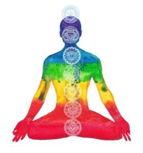
Each palm is of the right hand, facing upward, open to receiving everyone’s grace. The palms are in the Seven Rainbow colours V.I.B.G.Y.O.R…. starting with Violet at 9’o clock position clockwise. And then there is an extra “Eighth” palm in a lighter subtler green colour at the 3’o clock position!
The seven palms with the V.I.B.G.Y.O.R represent the individual/s who is/are in contact with LifeMaximum and with each other too. And the eighth palm with the word LifeMaximum represents the facilitation being provided by LifeMaximum. And together they symbolise the LifeMaximum Community!
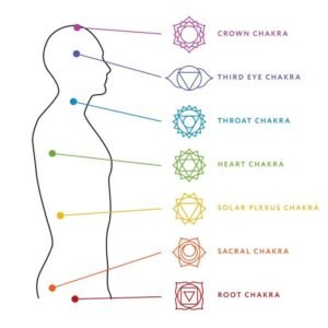
The VIBGYOR has Green at the centre. The 4th chakra, Anahata is the central gateway between the three lower chakras and the three higher chakras and it is also represented by this dark green colour.
Significance of the Anahata: The name of this chakra signifies the state of freshness that appears when we are able to become detached and to look at the different and apparently contradictory experiences of life with a state of openness (expansion).
Anahata is associated with the ability to make decisions outside the realm of karma. In Manipura and below, man is bound by the laws of karma and fate. In Anahata one makes decisions (“follows one’s heart”) based on one’s higher self, not the unfulfilled emotions and desires of lower nature. As such, it is known as the heart chakra. It is also associated with love and compassion, charity to others and psychic healing.
The subtler green colour in the LifeMaximum logo, is the more intrinsic nature of the darker green colour that is right in the middle of the 7 colours of the V.I.B.G.Y.O.R! That same light green colour extends into the text LifeMaximum.
In a manner of speaking, it is symbolic of the sole objective that LifeMaximum carries. That of impacting as many humans as possible in a manner that empowers them to Live their Life to the Maximum, by helping them open their hearts to their infinite potential.